Saying "Thank you" with Dear Lizzy Serendipity
Hello everyone!
It’s Nat here with my last project to share on the Hey Little Magpie blog for 2014!

The traditional gift-giving season is upon us! I thought this would be the ideal opportunity to leave a little handmade Christmas gift under the tree, to say “Thank you!” to a special someone. And what better way to brighten up the greyness of winter than with the beautiful new Dear Lizzy Serendipity collection. The colours in this line are so uplifting and sure to bring sunshine into your day.
And that’s what I wanted to do – pass on the sunshine to a friend, so that they could pass on the sunshine to someone else.

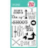
I made a set of five “Thank you” cards with my favourite papers from this collection, plus the clear stamps for this collection:
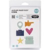
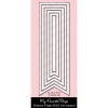
I’ve also picked out some alternative dies and stamps from the Hey Little Magpie store that you can use to recreate these looks:
So let’s take a closer look at what’s in that box!
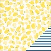
I just loved the lemon paper in this collection, in fact the name is just as fab as the paper itself! A great nod to Liz Lemon in 30 Rock… hehe  I love the combination of lemon tones with navy blue. The navy and white stripe pattern on the reverse of this paper is a great border accent to frame the lemon design – a little goes a long way! And I added in more navy details with navy cardstock for the die-cut words and a navy enamel dot.
  And the Very Vanilla paper has a great ombre bokeh effect, just perfect when you want something subtle as the background to an aperture.
Staying with the lemon tones and stripy accents, I thought it would be nice to combine the “just a note to say thank you” with an actual “note”.

You can easily make your own little envelope from kraft cardstock, scored with a couple of lines from corner to corner, and add a punched heart or two – complete with Stickles of course! The lemon yellow is also lovely against seafoam blue, I used the reverse of the Little Things paper in this collection a lot for all my light blue accents and to stamp on.
And talk about Serendipity with this project, I had a stamping accident on this card and had to cover up the booboo somehow, so I cut a strip of the blue paper and restamped the greeting and hey presto the greeting stands out even more, especially with some extra Stickles as a border. Phew!
 And on a similar “note” – the seafoam enamel dots are from the same pack as the Navy ones. Love the Basic Grey Basics line of candy buttons – grab those enamel dots while you can!
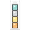
Next we have a rainbow of colours – as soon as I saw the jar stamp in the stamp set for the Serendipity collection, I knew I wanted to create a jar with lots of hearts floating out like butterflies.  I am a big fan of using dye ink to stamp with clear stamps – it’s completely transparent on your inked stamp so you can still see where you are stamping, plus the colours are much more subtle than pigment inks as the ink dries into the surface, it doesn’t sit on top of it. But to guarantee good results with dye inks + clear stamps you may need to condition your stamps so they are really ready to take the ink.
Tip: before using the stamps in this set, I rubbed over them all with a white eraser so the stamping surface was a little cloudier and “roughed up”. This will take the dye ink a lot better and prevent the ink bubbling on the surface of the stamp. Also when you use dye ink, you need to keep in mind that the stamped image will look splotchy to begin with, dye ink has to seep into the paper surface and will then dry out evenly. The finish American Crafts uses for their papers is perfect for stamping on, the ink dries evenly on it and doesn’t go splotchy. I’ve recently been using Hero Arts dye inks more and more, and my go-to colour for most sentiments and outlines is now their Charcoal mid-tone ink. It still stands out on projects, but isn’t as stark as black – really subtle and versatile!
 I stamped the jar in the Charcoal ink on the reverse of the Little Things paper, and also used the hearts stamp in the set with the Tide Pool dye ink for a tone on tone look. But to make things a bit more colourful, I die-cut lots of hearts in different sizes from the rainbow stripes in the Good Vibes paper. For extra pop I scored them in half before sticking them down so they do really look like they’re flying out that jar! Really simple, but really effective.
Here’s a simpler way to combine the stamps – just a patterned paper background, cardstock cut with a journaling card die, and some stamping on paper:
 Before stamping the jar on the paper, I wanted to create a label for the jar to add the greeting. I stamped the sentiment in Charcoal grey on a strip of white scrap paper from this collection and added a border using the scallop stamp in the Serendipity stamp set in pink. I cut the label to the right width then stuck it on a piece of the Little Things paper and then finally stamped the jar image over.

It’s a nice simple image to fussy cut with scissors and just add a bit of 3D foam tape to make it pop against the journaling card. Add just a smattering of stamped hearts coming out of the jar and done!
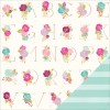
And finally, a very zingy number to finish with – I just couldn’t resist the ultra-bright and busy floral pattern in this collection. I love the hint of “gold” in the outlines to the painted flowers and leaves. Just gorgeous – I couldn’t help but add a little gold sparkle to tie it all together.
 I wanted to share a quick tip for making word die-cuts really pop out and zing on your projects without using 3D foam. The least-fussy word dies for this technique are where the whole word is cut in one piece.
- Cut the stitched label piece twice: first from the Very Vanilla paper and then from cream cardstock.
- Then cut the “thanks” die in the Very Vanilla label to create a negative die cut.
- Stick the Very Vanilla label on the cream cardstock label.
- Cut the “thanks” die from raspberry pink cardstock three or four times.
- Slot the first raspberry “thanks” die-cut into the negative impression on the label, then repeat with the other die-cuts until you’ve layered the greeting as much as you want.

I love that with this technique you get a complete solid popped out greeting – it really stands out from all sides. But you don’t just have to use the same colour for each layer. Why not have the top layer another colour to the layers below it? Or have all the layers white except the top one? The possibilities are endless!
Well that’s it for this project and it just remains for me to say “thank you” for reading! I hope you have a wonderful holiday season and a very happy New Year!
Here’s to more happy crafting in 2015!


